InsightsBrand strategy
Bilingual is not translated: designing Arabic and English as equals
Why the Arabic version of a brand should never be the last step, and what changes when it comes first.
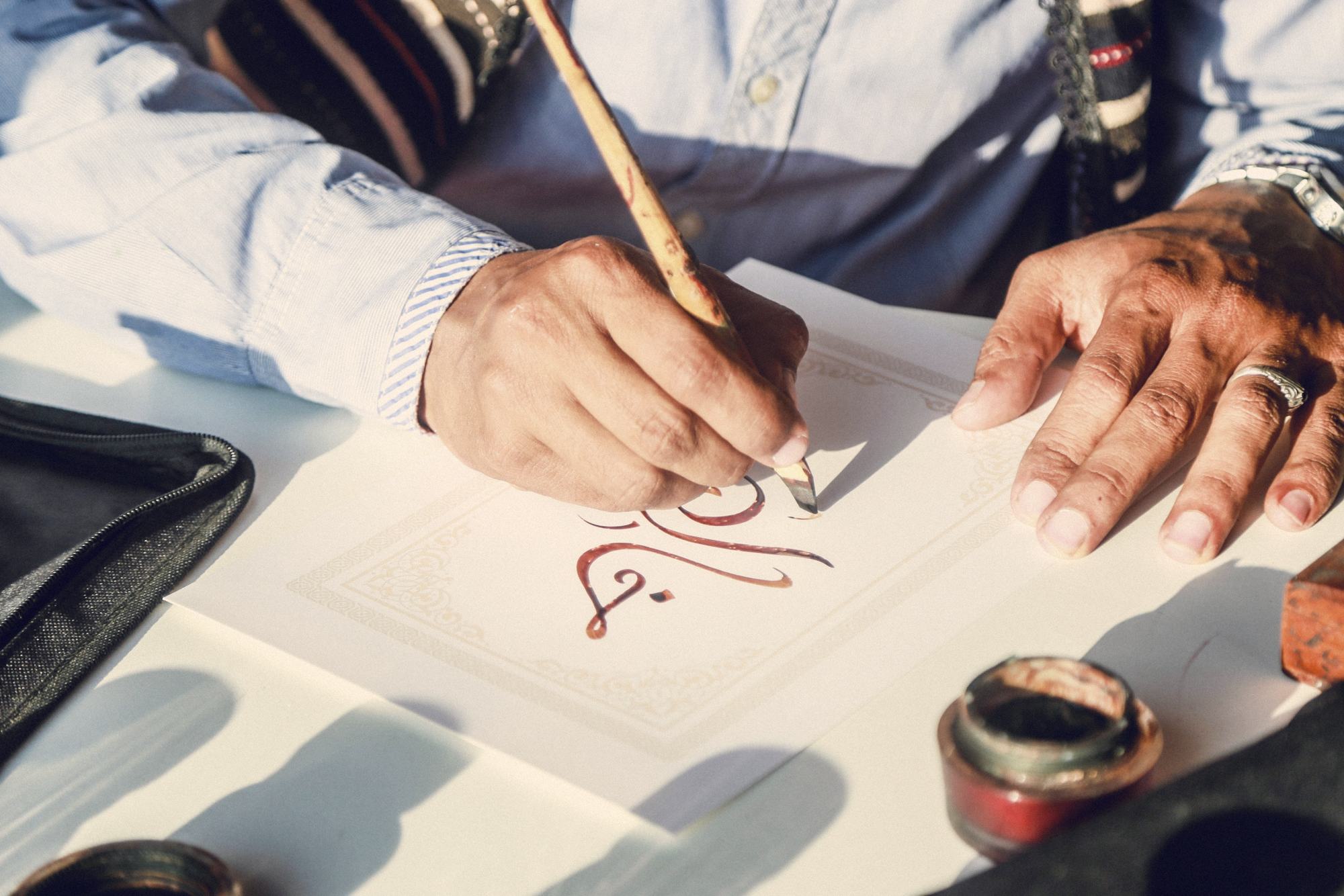
In many Gulf projects, the Arabic version arrives late. The English copy is approved, the layout is signed off, and then someone is asked to “add the Arabic”. The result is familiar: a mirrored page, a font chosen because it was available, and sentences that read as translations because they are.
Audiences notice. Arabic readers can tell within a line whether a brand was written for them or converted for them.
01Write, don’t translate
A tagline that works in English often has no natural Arabic equivalent, and the reverse is true. Treat each language as its own draft, written to the same brief. Agree the idea first, then let each language find its own words for it.
We write in Arabic; we don’t translate into it.
02Choose type as a pair
Arabic and Latin typefaces should be chosen together, so that weight, rhythm and personality match. Arabic usually needs to be set slightly larger, around ten percent, and with more generous line spacing, so that both scripts feel equal on the page.
03Lay out right to left, properly
Right-to-left is more than flipping a layout. Reading order, navigation, icons that imply direction, number formats and the placement of images all need decisions. Some elements mirror; others, such as logos and media controls, should not.
AfterEqual weight
When both languages are designed from the first sketch, neither feels like an afterthought. The brand becomes one identity with two voices, and that is what audiences in the region expect.